Assessment Results

On July 27, 2015 my assessment results arrived. I had almost forgotten about the looming result deadline, so it was a bit of an anti-climax when I saw an announcement on the Facegroup Level 1 group that the results were in. I checked my email and found a results letter and a marksheet waiting for me.

The results letter confirmed Formal Assessment – PASS. Forty credits now earned – yay! The mark sheet gives a breakdown for the various assessment criteria as well as some helpful comments. All in all, I am really satisfied with the grade I achieved. The assessors comments are below and my comments are in italics.

Demonstration of technical and visual skills (materials, techniques, observational skills, visual awareness, design and compositional skills)

Very competent technical and visual skills.

Thank you.

Quality of Outcome (content, application of knowledge, presentation of work in a coherent manner, discernment, conceptualisation of thoughts, communication of ideas)

Competent realisation of ideas, presented well, showing consistency in judgement. Effective grasp of ideas and communication of visual ideas.

I’m happy with this.

Demonstration of Creativity (imagination, experimentation, invention, development of a personal voice)

Some evidence of creativity, little evidence of risk-taking with a few imaginative outcomes, some evidence of a developing personal voice.

This is the piece that I probably struggle with the most. I’m happy the assessors can see evidence of a personal voice developing – it is not obvious to me yet as I still feel all over the map.

Context (reflection, research, critical thinking)

Evidence of self-reflection and research, and satisfactory ability to analyse and synthesise information.

I know there is room for improvement here and it will come with more studies.

Overall Comments and Feed Forward
You presented a really organised and considered overview of your progress through this module which meant that it was very easy to follow your progress for assessment. It is also clear that you have a good eye for a formally well considered image and an improving grasp of the kinds of colour and feel in a photograph that interests you.

Thank you.

That said, you can afford to be much bolder with the way you interact with your subject matter and this is exemplified in assignment 5. Here you have presented an interesting and considered set of landscape images but there is no sense that you have conceptually or visually researched this interesting site as thoroughly as you might. Try to immerse yourself FULLY with your subject matter, this will mean that you will move your ideas and approach towards a much more refined and considered outcome.

I’m going to have to work on this and figure out how to do this. Hopefully there will be an improvement by the end of the next module.

Well this is my last posting for The Art of Photography. I have now signed up for Context and Narrative. To everyone who has followed this blog, I thank you sincerely for your interest and support and invite you to follow my photographic journey in my new blog https://lyndakuitphotographycn.wordpress.com/ .

Note to the Assessors

Dear Assessors,

Thank you for taking the time to evaluate my work.

My learning log is online and can be located at: https://lyndakuitphotography.wordpress.com/. The blog is in descending date order (standard blog format), however, I have arranged the assignments so that they can be viewed in consecutive order. Each assignment’s post begins with the assignment, followed by the tutor feedback and my reflections and ends with any revision/rework that I have done as a result of the tutor feedback.

To access each assignment, tutor feedback and any revisions done, please click on the assignment number you wish to view on the menu at the top and you will be able to scroll in consecutive order.

My research is accessible by going to the submenus under Research and Reflection on the menu at the top of the blog as illustrated below. Research relevant to each assignment is mentioned in my assignment write up and is hyperlinked to the relevant posts as well.

Included in my submission package are:

  • the contact sheets of prints for each assignment as well as the final reworks or revisions. Contact sheets are clearly labeled on the back of each sheet.
  • a selection of four (4) prints from assignments 1, 2 and 4 and five (5) prints from assignments 3 and 5 (total of 22). Prints are clearly labeled on the back of each print.
  • a mockup of assignment 5
  • all five (5) tutor reports
  • two (2) supplementary physical learning logs which I have mainly used for inspirational images and study notes.

Thank you.

Reflections on The Art of Photography

As the time draws near for assessment, I will briefly reflect on my studies while doing The Art of Photography this past year. I have enjoyed the course immensely and learned a lot from it. I came into it expecting it to be a little more technical than it was, but I have really enjoyed the discoveries of new photographers, going to exhibitions (which was something quite new to me) and all the various exercises and assignments. My fellow students on the Facebook Level 1 group have been fantastic and very supportive. It is great that we have formed a bit of a cohort. I particularly like the way knowledge is shared on this group. My special thanks to fellow student, Holly Woodward for setting up the group. She has done an amazing job. My thanks as well to my tutor, Robert Enoch, for the constructive criticism of my work. Sometimes the criticism was hard to take, but in retrospect it was necessary and right. I like the freedom that distance learning affords me. I enjoy working at my own pace, although it does require quite a lot of self-discipline. So I will touch on a few points below that have stood out for me over the course of this past year. More in-depth reflections can be read under each assignments’ tab.

Demonstration of technical and visual skills (materials, techniques, observational skills, visual awareness, design and compositional skills)

My observational skills, visual awareness, design and compositional skills have improved tremendously since the start of the course. I had a fairly good idea of composition when I started the course, but feel that with slowing down and taking my time more in setting up my shots I have taken care to check to the edges of my frame more carefully. This has now become a habit, which is a very good thing.

Quality of Outcome (content, application of knowledge, presentation of work in a coherent manner, discernment, conceptualisation of thoughts, communication of ideas)

During the length of the course I have become comfortable with using my blog for personal reflections. I used to set up websites in Dreamweaver for work purposes so getting to grips with WordPress’s layout and navigation was a not a steep learning curve for me. At times I still struggle to conceptualise my thoughts properly – the words are there but they just don’t want to come out in the right way, but this has improved quite a bit since the start of the course and I know this will improve the more familiar I become with reading and commenting on aesthetic aspects of photography and pick up the relevant academic language. I haven’t done any serious lengthy writing since the mid 80’s and I’m finding that I quite enjoy these reflections and analyses. I have managed to brush up my LightRoom digital darkroom skills and have seen the improvement that a little simple post processing can do to a photograph to take it to another level. My least successful assignment would be Assignment 2. Initially I had planned on doing the elements of design through landscape of Alaska, but the thought of possibly having to redo parts of the assignment forced me to change my plan and I decided to do raw materials of food instead. As so often happens in life, usually one’s first instinct is the right one and I should have bitten the bullet and just gone with the Alaskan landscape as originally intended. Notwithstanding though I do feel that I learned a few valuable lessons from my Assignment 2 about lighting and set ups. It also helped to cement the fact that I do not like still life photography, although I will still try and overcome this dislike over time. My most successful assignment I think would be Assignment 5 and it would have been perfect if I had been able to get the close up portrait images that the series lacks. Hopefully I will be able to expand the series in the near future and include those lacking shots.

Demonstration of Creativity (imagination, experimentation, invention, development of a personal voice)

My creativity has definitely come a long way since the start of the course. This is something that I do struggle with. The assignment I had the most fun with was Assignment 4 – Apply Lighting Techniques as there was a lot of experimentation that went on, especially around the colour photographs. It was also the most frustrating assignment in that I had to do things by trial and error and a lot of my ideas didn’t come to fruition, but this was mainly due to lack of equipment and weather. I also enjoyed the narrative exercise at the beginning of part 5 in that I used abstract photograph to tell the story of my husband’s recent illness in the form of a shadow diary. A lot of emotion went into this exercise and this is the first time that I have exposed myself in such a manner and I found it rather liberating. Fellow colleagues at work follow my blog and say that they can see a change in my photography, a maturity that is emerging and I can see this too.

Context (reflection, research, critical thinking)

I have always enjoyed doing research and when I first started the course I asked my tutor what I should research. He replied to me “anything”. So I literally took him at his word and did research on anyone who took my fancy for the first two assignments. During the third assignment I took a more focused direction and concentrated on a couple of photographers that my tutor had recommended to me. However, it was really during the fourth part of the course that I realized that I should be researching photographers and artists who can direct and shape my work in the current assignment. So I concentrated on that approach for the last two assignments and found that things started to fall into place quicker and I found my work becoming a more cohesive unit. I wish I had had this Eureka moment earlier in the course, as it would have made things a lot easier for me. I was fortunate to have two of my reviews picked up and commented on by the photographer and gallery respectively. I find that when I look at images now, I am more introspective of them. I have moved past the “like/don’t like” phase and now can analyse and appreciate the different aspects of the photograph.

Finally but most importantly, my thanks to my patient family members who sometimes accompanied me on various photography outings in all kinds of weather and at all times of day, and to my work colleagues for their encouraging support and comments.

And so I move on to Context and Narrative, my next course where I hope to continue this wonderful journey into photography.

Assignment 5: Applying the techniques of illustration and narrative

The brief:

In this final assignment imagine that you are about to illustrate a story for a magazine. You have a cover to illustrate, and several pages inside (create between 6 and 12 images – you can choose). Even though there may be no text, you should write captions (of any length) to explain and link each picture.

The cover picture will need some of the techniques of illustration that you have been experimenting with. The picture essay will be more of a narrative. This means that, as you will be using several photographs to illustrate the main body of the story, you will have the opportunity to spread the load of the story telling among them. Different images can deal with different aspects of the subject, or you might choose to nsert a linked series of photographs that show something happening in sequence. Remember that some of these photographs will be seen together on the same pair of pages. You can use this to set one image off against another, sometimes the juxtaposition of two appropriate images can be telling.

Any theme which has a narrative element could be a suitable subject for this project. … Remember that a narrative will contain the element of time – hours, days, weeks or maybe even just seconds.

I have had the idea of photographing Finn Slough ever since my friend mentioned this unique place to me around the time I was busy with Assignment 2. I had never been to the place, had no idea what to expect and just put it on the backburner. While I was working towards Assignment 4 the idea of shooting in this location really started to percolate with me and I decided to do a bit of online research into the place.

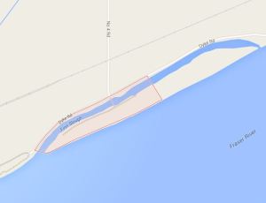
Finn Slough is really off the beaten track, not a tourist destination at all and I was actually surprised to learn that many people who have lived their entire lives in this city have absolutely no idea that this place exists. The information I found on it was scant to say the least. Just a a historical write up on a couple of sites and one or two blogs I came across. I have included a map of the location as a reference, but this is not part of my narrative. It is simply there for a bit of context.

I have omitted EXIF data under the photographs as they do not form part of a narrative. However, the information is available here in a table for references purposes. For the same reason I have not provided a commentary on each image as I have done in the past. If it is necessary, then I’m happy to add it. I have included a PDF of the images below and have been cognizant of Clive’s remarks in the OCA fora that it is best to keep the layout simple. I am not a graphic designer, nor a layout expert, so I am taking that advice on board.

My post processing was mainly confined to highlight, shadow and contrast adjustments, a little bit of clarity and vibrance, setting of white and black points and lens corrections and of course sharpening.

Finn Slough

Finn Slough


Finn Slough

a memory of how things were

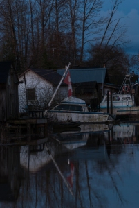
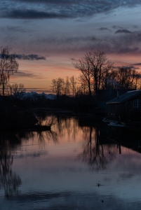
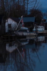
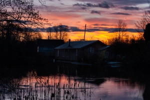
Finn Slough at high tide just prior to sunrise

Finn Slough at high tide just prior to sunrise

In the 1890’s a group of Finnish immigrants came to the city of Richmond and settled at the junction of what is now called No. 4 Road and Finn Road. The immigrants initially worked as loggers and coal miners while they were saving up money to buy land that had access to the mighty Fraser River so that they could fulfill their goals of becoming fishermen.

Richmond is an island that is below sea level and at that time the dykes were all hand built. The land where the Finns initially settled was close to the Fraser River, but not situated next to it. However, houses had to be built on pilings due to the levels of the high tide where the levels of the river would rise and flood the farmlands.

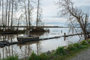
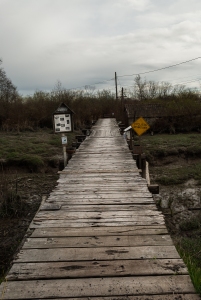
The drawbridge at Finn Slough which provides access to Gilmour Island. During high tide residents going out in their fishing boats have to remove the vertical planks in the middle of the bridge to enable the boats to pass through to the other side in order to exit to the Fraser River.

The drawbridge at Finn Slough which provides access to Gilmour Island. During high tide residents going out in their fishing boats have to remove the vertical planks in the middle of the bridge to enable the boats to pass through to the other side in order to exit to the Fraser River.

The Finns eventually moved next to the river to what is now known as Finn Slough. The Finns needed places to store their gill nets and built net sheds next to their new houses on pilings.

By 1910 more Finns and Scandinavian immigrants had settled in Finn Slough. The second wave of immigrants was not as wealthy as the original settlers as they had fled the repressive regime of Russia in poverty stricken Finland. As a result they were not able to buy large parcels of land and many either slept on their boats or in the net sheds.

The settlement originally comprised of about 70 dwellings, but has dwindled to about 30 in present times.

Finn Slough is a swampland and has been designated as a wetland, with some of the dwellings being situated on the nearby Gilmour Island. The residences on Gilmour Island are accessed by a drawbridge and access to the houses is via a boardwalk that has been built over the swamps.

What is left of Finn Slough today is a memory of how things were1, but more importantly it is now an example of how a community can self regulate itself and co-exist with nature in harmony.


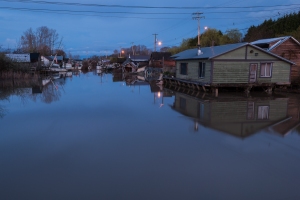
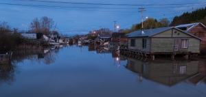
Western view of Finn Slough at high tide just prior to sunrise

Western view of Finn Slough at high tide just prior to sunrise

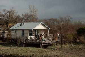
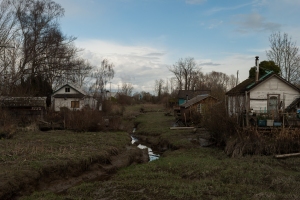
A Finn Slough resident tends to her pot plants on her deck in the early morning hour.

A Finn Slough resident tends to her pot plants on her deck in the early morning hour.

High tide and sunrise over Finn Slough, with the Cascade Mountain range in the distance.

High tide and sunrise over Finn Slough, with the Cascade Mountain range in the distance.

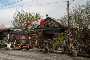
Virginia, one of the residents, decorates her house with found flotsam and jetsam items that come in on the tide. She recycles as much as she can, reusing wooden beams from houses that have fallen into disrepair.

Virginia, one of the residents, decorates her house with found flotsam and jetsam items that come in on the tide. She recycles as much as she can, reusing wooden beams from houses that have fallen into disrepair.

Residences east of the drawbridge. The brown building on the left is named “Sisu” which means “persistence” in Finnish.

Residences east of the drawbridge. The brown building on the left is named “Sisu” which means “persistence” in Finnish.

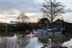
A reminder that the past has caught up with the present, as a Seaspan ferry boat makes an early morning voyage past Finn Slough to one of the harbours on the mighty Fraser River. The fishing boat, Eva, lies moored safely to its dock. Eva is 28 feet long and was built in 1937.

A reminder that the past has caught up with the present, as a Seaspan ferry boat makes an early morning voyage past Finn Slough to one of the harbours on the mighty Fraser River. The fishing boat, Eva, lies moored safely to its dock. Eva is 28 feet long and was built in 1937.

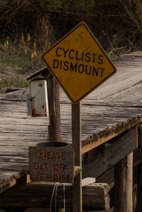
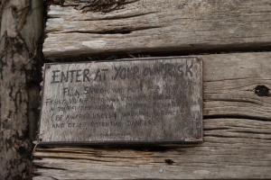
Sign on drawbridge: Enter at your own risk. Finn Slough was built as a working fishing village (1890) and was not designated as a tourist destination. Please beware (be aware) uneven walking surfaces and other potential dangers. www.finnslough.com

Sign on drawbridge: Enter at your own risk. Finn Slough was built as a working fishing village (1890) and was not designated as a tourist destination. Please beware (be aware) uneven walking surfaces and other potential dangers. www . finnslough.com

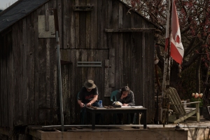
A couple sits on the deck in the afternoon spring sunshine. The gentleman is sharpening his axes, while his wife is enjoys a snack and reads the Sunday newspaper.

A couple sits on the deck in the afternoon spring sunshine. The gentleman is sharpening his axes, while his wife is enjoys a snack and reads the Sunday newspaper.

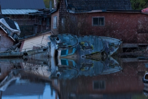
The Mermaid III fishing boat lies abandoned amongst other debris at high tide.

The Mermaid III fishing boat lies abandoned amongst other debris at high tide.

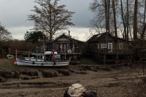
The fishing boat, Eva, lies stranded on the mud in front of the Dinner Plate Island School house at low tide.

f8, 1/250, 26mm, ISO 100
The fishing boat, Eva, lies stranded on the mud in front of the Dinner Plate Island School house at low tide.

The entrance and exit to Finn Slough and beyond the might Fraser River that provides a livelihood to thousands of people along its banks. At low tide no boats are able to exit the Slough. Since this is a tidal area, fishermen have to think ahead when the fishing season starts.

The entrance and exit to Finn Slough and beyond the mighty Fraser River that provides a livelihood to thousands of people along its banks. At low tide no boats are able to exit the Slough. Since this is a tidal area, fishermen have to think ahead when the fishing season starts.


The PDF version of this narrative can be seen here. The wide image (A reminder that the past has caught up with the present, as a Seaspan ferry boat …) is intended to be a double page spread.

ASSESSMENT CRITERIA

Demonstration of technical and visual skills (materials, techniques, observational skills, visual awareness, design and compositional skills)

My equipment used for this assignment were my 18-55 mm, 55-200 mm and 70 – 300mm lenses and tripod. I have tried to use elements of all previous assignments in this assignment, from contrasts to elements of design, colour and lighting. I did not use any artificial lighting in this assignment, but relied on natural lighting. I was able to varying my exposure times as I was shot just prior to and during sunrise on one day, so used long exposure during these times. It was a bit nerve wracking standing and moving in the dark on an old narrow bridge with no railings, the boards of which were dotted with holes just the perfect size for a tripod leg to fall through.

Quality of Outcome (content, application of knowledge, presentation of work in a coherent manner, discernment, conceptualisation of thoughts, communication of ideas)

I am rather pleased with my set of images. Ideally, I wish that I could have submitted 15 images for the narrative, as I feel that certain key elements would have been more clearly interpreted. Finn Slough is a place that has a lot of story to tell and I did have to leave some good story telling images out. What I wanted to illustrate right from the start was the difference in appearance of this location during the tides. I have therefore, repeated an object, namely the Eva boat in high and low tide settings as the low tide image with the thick mud was what I most wanted to convey and this vantage point was the only one that really lent me that opportunity. I did find that with each visit to Finn Slough, new ideas popped up, not to mention new material to shoot. I chose not to apply a linear approach to this narrative as I think mixing up the low tide, high tide, sunrise and afternoon shots create more of an engaging dynamic to the narrative and lends a bit more mystery to the story. As mentioned above, I have been mindful of Clive’s comments in the OCA fora and his advice given on Flickr to keep the presentation simple. I am not a journalist or graphic designer so have chosen to follow his advice on this and have kept my narrative’s layout very simple. I think my narrative’s text and captions reads well and have tested it on a few colleagues to see if my idea was communicated.

I have come to enjoy my online learning blog and I think it has come along quite nicely. I am still struggling with the physical log, trying to remember to carry it with me, but I have mainly been using it for inspiration images that are copyrighted which I can’t replicate on the online blog along with study notes.

Demonstration of Creativity (imagination, experimentation, invention, development of a personal voice)

I have tried to show the location in all its facets, at low tide with the muddy swamp land dotted with skunk cabbages and grass and at high tide when the waters of the Fraser River push new life into the Slough.

I feel that this set of images (as well as the other 370 odd images I took at this location) is probably one of my most cohesive assignments. I visited the location on four separate occasions at different times of the day and during different weather patterns so I was able to experiment with different natural lighting conditions.  I would have liked to shoot from some other positions along the river banks, but due to access restrictions and swamp shrubbery I was not able to do that. I did engage with one of the residents for quite a while and asked whether I could make a portrait of her outside her quirky house, but unfortunately she declined and did not want to be photographed.

Looking back over the course of this past year, I can see that my photography style has changed and is maturing. I have begun to insert myself into my work as can be seen in the narrative exercise at the beginning of Part 5.

Context (reflection, research, critical thinking)

I have touched briefly on my research into the subject of Finn Slough in my introduction and my research items are listed below in the bibliography. I also made sure to research the tide tables so that I had a clear idea of when high and low tides were on the days that I went to shoot. As it happens these tables also provided sunrise and sunset times, which was a very handy tool.

I was very pleased that I was able to attend more exhibitions during the time leading up to this assignment than in previous ones. The exhibitions that I attended were:

Due to the Capture Photography Festival there have been a few good documentaries on TV on photography which I have watched. I have only reviewed one thus far:

I did an online course on Narrative Photography which I found rather useful in that various workflows were explained in some detail:

The photographers that I researched for this assignment were:

I am extremely grateful to David Hlynsky and Alan Henriksen who both gave me permission to use some of their images for my reviews and also for their encouraging words to me.

Book Reviews:

I feel rather as if I’ve been caught up in a whirlwind during this assignment. I have been so busy going to galleries, taking trips out to the location, doing research and plodding through Sontag. I even usurped two walls in my office and put up my photographs so that I could “live” with them during the edit down process.  This actually proved to be quite useful as colleagues would stop by my office to look at the photographs and pass comments, some of which were quite helpful. It’s with mixed feelings that I come to the end of this course, The Art of Photography. Sad because it is the end of a long road that was both enjoyable and frustrating at times, yet happy and eager to move on to the next course and new discoveries.

References

1. Dorrington, David A Small History of Finn Slough [online] Finn Slough Heritage and Wetland Society http://www.finnslough.com/

Bibliography

2015 Tide Table for Steveston, British Columbia for fishing [online]. Available at http://www.tides4fishing.com/ca/british-columbia/steveston [Accessed 9 March, 2015]

Finn Slough. [online] Biodiversity of Richmond, British Columbia. Available from: http://ibis.geog.ubc.ca/richmond/city/finnslough.htm [Accessed 30 March, 2015]

Finn Slough Heritage Area Online Heritage Inventory [online] City of Richmond, British Columbia, Canada http://www.richmond.ca/plandev/planning2/heritage/HeritageInv/details.aspx?ID=167 [Accessed 30 March, 2015]

Freeman, Michael (2012). The Photographer’s Story: The Art of Visual Narrative. Lewes, England: The Ilex Press.

Ho, Megan (2013) Visit Historic Fishing Village Finn Slough [online] Inside Vancouver. http://www.insidevancouver.ca/2013/08/05/visit-historic-fishing-village-finn-slough/ [Accessed 30 March, 2015]

Short, Maria (2011). Basics Creative Photography 02: Context and Narrative. Lausanne, Switzerland: AVA Publishing SA.

Assignment 5 – Tutor Feedback

I awaited my tutor feedback for Assignment 5 with bated breath, hoping it would come in time for me to get my submissions ready for assessment. It arrived this afternoon. I have added my comments in italics.

Overall Comments

My tutor stated that this was my most mature and interesting assignment to date. It showed my technical and visual development over the course and showed my potential as a degree student and a professional photographer. He found the subject of Finn Slough both fascinating and strange, the proximity to the water is palpable in my photos and was the visual key to the project as a whole.

[Thank you. I had really enjoyed working on this project and found that I ‘found my groove’ with it.]

However he stated that there was one major flaw with the project and wanted to know where the community was in this series about a community. He assumed that it was the immigrant community that attracted me to Finn Slough and mentioned that presumably the descendants of the original Finns and ex-Soviet states were still living in the slough. He said it would have been a wonderful opportunity to look into a micro-world that has managed to remain aloof from our globalized society and see how their culture has survived, developed and cross-fertilized with Canadian life.

[While I get where he is coming from, in that I did not get close up portraits of any of the people living in this community, they do feature in two of my photographs. According to the research I have done very few descendants from the original families still live in the slough. I think there are two at most. While some still fish, it is now mainly an artists community now.]

The other obvious criticism is the lack of a clear narrative. This is a series, and it is a good series, but there is a difference between similar kinds of photo repeated and a developing story where something changes, grows, time passes. The narrative that is suggested to me is connected to the tide rather than the light. You have images here of very high tide and one of low tide. This dramatically transforms the landscape, turning a water-logged land into a land of muddy channels.

[There were two photos that had the same subject, namely the historical boat, Eva which show the location both at high tide and low tide. My narrative was always meant to be about the tides rather than the light, although shooting at different times, days and during different weather conditions would definitely have changed the light. I believe some of these lighting conditions served to enhance the images, rather than detract from them. Actually there are six images taken at high tide and four images taken at low tide. The images where the subjects are surrounded by grass (no 2, 4, 7) are all low tide images. This is a wetland area and vegetation grows below the water, grass, bulrushes, skunk cabbages and so on. Perhaps my captions lacked this explanation.]

My tutor went on to say that the work is promising and that I should continue with my studies. He further suggested that this project could develop into a larger body of work that would include the missing elements he has mentioned.

Feedback on images

Cover

My tutor suggested that the photo was not sharp, that it look as if it had been blown up.

[The photo was not blown up, but he may have been picking up on the blur on the flag. It was a long exposure taken just before dawn and there was a breeze blowing. However I have another photo of the same scene which was taken during a lull in the breeze which I will substitute].

2

This was not an interesting image according to my tutor. He said I needed to figure out how to give it more depth of meaning visually.

[I have another photo of the bridge which I will substitute].

3

This is an atmospheric water-scape giving the best overview of the living conditions in this place with the houses on stilts. You’ve maybe got a little too much of the empty water, but it’s still a strong shot.

[I have to agree on the empty water. I had cropped it, but found that I was losing too much detail on the left bank. I shall try a panorama crop].

4

The house is another wonderful photo, plenty of telling detail here in really lovely light. Where has the water gone? Should you have included it in the frame to retain the watery theme?

[Thank you. I agree the light was fantastic at that time. Where has the water gone? It is low tide, so the water has gone out to sea. During low time Finn Slough is totally emptied of water].

5

It’s good to see the mountains in the distance. This maybe a little too pretty and disconnected to form part of the series, where is Finn Slough here? This could be anywhere. You could try lifting the houses out of the dark more. (Note that this may be a monitor issue).

[I can see your point that it may look too pretty for the series, so I will substitute another photo that I took of the same house at a slightly different angle].

6

This house looks so full of character that it makes me want to meet the people who live here. It looks like something designed by a set designer, but it’s real and it’s organic. It is also interesting to see the Canadian flag flying, which could say something of the need to defend oneself from xenophobia.

I think this shot would have been improved if you had placed the inhabitants in front of it, on the road, closer to camera. This would have created a relationship: house + the people who live there.

[I agree with the point about the house. It is laden with character. Personally I think the xenophobia bit might be stretching it a bit. Canada is one of the few multicultural countries in the world where multiculture is actually working. Canadians are a patriotic people and like their American counterparts, they love to fly their flag from their houses. Many immigrants have also taken to flying their homeland’s flag outside their houses and apartments as well. I totally concur that this image would have been raised to a different level if I had been able to photograph the inhabitant. I did speak to her on several occasions and asked if I could take her photo, but she refused and I have to respect her wishes].

7

It’s wonderful to see the connection between these houses and the landscape, there is not an assault on the land here, but a true dwelling in it. Sisu is an interesting word here because this place would sure require a lot of it!

8

There is a contrast here, but it is not that clearly visualized by this shot because the Seaspan ferry is obscured by trees. Good that you noticed it though.

[What most attracted me to this image were the various layers from front to back: the foreground water, the row of houses, the row of vegetation behind them, the Fraser River with the ferry passing by and beyond that another island and of course the sky].

9

Another sign, which I think you can cut out of the series.

[I rather like the sign which is on the old drawbridge. I find it rather ironic that a bridge that was built in the 1940’s would have a sign on it that features a website URL. As this was one of my details shots, I will substitute it for another].

10

This was an opportunity to get a lot closer. This couple are evidently engrossed in their work and their heads are down. That can work if their work is illustrated by their body postures in a strong way. But here, it is unclear. A formal portrait using the wooden shack as a background would have presented more visual interest.

[Yes, it would have been nicer to be able to get closer, but it was high tide and they were across the river. I was as close as I could get].

11

The Mermaid is a remarkable shot with beautiful light and colour. It could well be the cover shot because it works almost as an optical illusion with oddly placed planes – like a Cubist painting. It’s bizarre. Well spotted and well framed.

[This image has grown on me. At first I didn’t like it, but after having lived with it in my office for a few weeks, I have come to appreciate the intricacies of it. If held in portrait format it looks like an abstract of a totem pole].

12

This is a much more satisfying shot of the Eva in front of the old house, though I think you will need to choose either one or the other because this looks like repetition. The light, tones and colours are really beautiful and it’s interesting that we see the dry river bed at low tide here for the first time.

[I agree that there is repetition. I was worried about that. I desperately wanted to depict high tide and low tide and aesthetically speaking the Eva was the best choice that was accessible. This was also the only location where I could get a “pure mud” shot as just past this the river bed is covered by vegetation].

13

The old “taken from the road shot”! It does appear a little lazy when the road appears as a diagonal at the bottom of the frame. Apart from that it’s a shot that could work, showing the tall thin trees and the little islands and spits.

[Actually the shot was taken from the dyke wall. As this is both the entrance and exit for the boats of Finn Slough I do think it is a good closer].

Learning Logs/Critical essays

The blog and your research are looking good. A bit more studying will give you the terms you lack in explaining photographs.

The accompanying text does show some immaturity (unlike the images) because it doesn’t really add much other than anecdotal information.

[I’m not sure I completely understand this statement. The brief stated that we should just write captions, which according to the Oxford Dictionary means “words printed with an illustration or photograph in order to describe or explain it.”]

I like the way Virginia has decorated her house with flotsam and jetsam, but Virginia is missing from the shot so the text tries to ‘stand in’ for the missing person.

[I have already explained Virginia’s absence above and in my assignment. She did not want to be photographed].

The historical information is interesting as an opening but it does tend to look somewhat incongruous when we see that it is essentially a landscape series. Such a text would then focus more on the nature of landscape.

[Point taken, but I do feel that the history is rather necessary to understand the landscape too].

Your visual skills are getting stronger and there are photos here that could turn up in National Geographic or some such magazine. You are noticing the light, the colour and the texture of things and ordering shapes in the frame really well.

[Thank you! That is very encouraging to hear].

Suggested reading/viewing

I see you’re reading Sontag’s ‘On Photography’, which can be difficult. Try David Bate’s ‘Photography: Key Concepts’.

[I had noted in my review on Sontag’s ‘On Photography’ that I had read it through once. I purchased Photography: Key Concepts after the tutor’s same recommendation in Assignment 4 Tutor Feedback].

Assignment 5 – Reworked

As a result of the constructive feedback I received from my tutor, I have made a few revisions to my final assignment.

My tutor mentioned that my cover image was not sharp and thought that it was a blown up image. While it was mot definitely not blown up, I do agree that it lacked a bit of sharpness. The flag which forms an immediate focal point was caught in a pre-dawn breeze and due to the long exposure it caused a blur. I have substituted another image which does not have this movement.

Finn Slough at high tide just prior to sunrise - revised

Finn Slough at high tide just prior to sunrise – revised

My tutor had remarked that my second image was not very interesting and needed more depth, so I have substituted an image that shows the whole bridge at Finn Slough, taken during a low tide.

Drawbridge at Finn Slough

The drawbridge at Finn Slough which provides access to Gilmour Island. During high tide residents going out in their fishing boats have to remove the vertical planks in the middle of the bridge to enable the boats to pass through to the other side in order to exit to the Fraser River. (Revised)

For my third image, my tutor remarked that I maybe had a bit too much water in the foreground. I did agree with this as this has initially worried me. I have now give the image a panorama crop and I think it is better this way.

Western view of Finn Slough at high tide just prior to sunrise

Western view of Finn Slough at high tide just prior to sunrise – reworked

I have not changed the following image at all, but simply added to the caption to make it clear that it is a low tide image.

White house

A Finn Slough resident tends to her pot plants on her deck in the early morning hour. At low tide the wetlands grass and skunk cabbages, which are usually covered by water when the tide is in, are visible.

My tutor thought my fifth image was perhaps too pretty and suggested that I lift the houses out of the darkness more. I had already lifted them quite a bit and as the sunrise was behind the houses I think it would have looked unnatural if the houses had more light in front of them than behind. So I have substituted this image for another of the same house shot just a little later during sunrise.

High tide and sunrise over Finn Slough

High tide and sunrise over Finn Slough. (Revised)

While I found that the sign on the drawbridge (9th image) revealed an extra element of the character of Finn Slough, I have removed it as per my tutor’s suggestion, but have substituted another detail image of an element close to someone’s home.

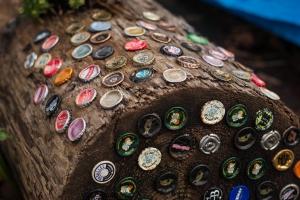
Beer bottle tops in a cedar log create a novel decoration next to a gang plank leading to a resident's home.

Beer bottle tops in a cedar log create a novel decoration next to a gang plank leading to a resident’s home. (Revised)

Also as suggested by my tutor I have removed the image with the Seaspan ferry (figure 8).

The final narrative can be seen here in the revised PDF version. As a result of removing the Seaspan ferry image (figure 8) my layout changed and I could no longer put in a double page spread image as this would leave my PDF version with too much white space. However, if I had chosen to use space filler text such as Lorem Ipsum text then I would have chosen the Mermaid image (10th image) as the double page spread, but not being a graphic designer, I have opted to keep things simple.

I have had a mockup made as a magazine of the final narrative (the PDF above) for the assessment submission and while it was made by a professional print shop, I had failed to instruct the printer to add a back cover to the pages. I would normally request this to be corrected, but as the printer was doing me a special favour by not charging me and had dropped off the booklet while I was in a meeting, I did not want to appear ungrateful or misuse his kindness.

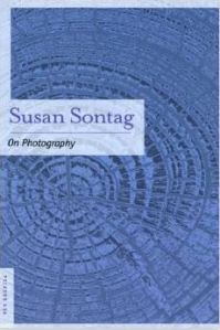
On Photography by Susan Sontag

I feel as if I have been ploughing a stoney field with a stubborn donkey and blunt plough shears after making my way through this book. Easy it is not! The book is a collection of essays ranging from a variety of philosophical subjects about photography.

Susan Sontag On PhotographySontag’s writing style is vastly different to that of Roland Barthes. She makes one search for those one or two nuggets of relevance or truth which is camouflaged in among a lot of verbiage about various philosophical writers like Plato, Balzac and such. I find her style rather arrogant and very academic. It is as if she expects the reader to know exactly what she is referring to or referencing. Expressions like “the Platonic depreciation of the image” (Sontag, p 154) and “the strategy of Proust’s realism presumes distance from what is normally experienced as real” (Sontag, p 164) abound throughout the book.

I found while reading that those paragraphs which actually meant anything significant to me were really few and far between. One of the sections in Plato’s Cave, however, did resonate with me. Sontag relates the story of when at the age of twelve, she came across photographs of Dachau and Bergen-Belsen concentration camps and the effect these photographs had on her. She states that:

… a part of my feelings started to tighten; something went dead; something is still crying. To suffer is one thing; another think is living with the photographed images of suffering, which does not necessarily strengthen conscience and the ability to be compassionate. It can also corrupt them. Once one has seen such images, one has strated down the road of seeing more-and more. Images transfix. Images anesthetize.’ (Sontag, p 20)

Having grown up in South Africa, I have seen the rapid increase of violent crimes throughout the country. In the early 1990’s newspapers no longer reported the murders of individual people. It wasn’t newsworthy enough. Multiple murders committed (five people or more) during the same incident were more newsworthy and believe me there were plenty. These images were broadcast regularly on TV without the requisite warning of “sensitive viewers might be offended” or “not advised for children’s viewing”. It was the news after all. This was almost a daily occurrence, with the result, that over the years one became desensitized to these images. One had to really, in order to remain sane. It is a survival mechanism. Once one becomes hardened to those types of images, it takes many years to develop a soft core again. Only after emigrating to Canada and living in this non-violent country where  murders in Vancouver total about twelve per annum, did the healing begin to set in. When 9/11 happened we had been in this country for about five years and I will never forget my reaction early that morning watching that horror unfold in real time. I stood and cried for those poor people. It took a catastrophic event like that to nudge my psyche back to health.

In America, Seen through Photographs, Darkly Sontag writes about Walt Whitman’s desire to show America in a positive light and Diane Arbus’s freakish works. Melancholy Objects deals with surrealism being at the heart of photography. Truth in photography is discussed in the essay, The Heroism of Vision. The old question of whether photography is art is covered in Photographic Evangels. In the final essay, The Image World she deals with the topic that society appears to prefer the ‘copy’ to the original. The photograph is more believable than the real thing. I am reminded of a joke I heard recently (I forget the source) where someone comments to a woman “My, but you have a beautiful son!” To which the woman replied “That’s nothing! You should see his photograph!”

I did not have the energy to do a second reading of Sontag, but I know that it is necessary and I will probably do so at a later stage. Preferably when I can digest the writing in an uninterrupted space and in small chunks.

References

Sontag, Susan. (1977) On Photography. New York: Picador

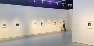
Pictured Windows – Equinox Gallery

Pictured Windows - Equinox Gallery

Pictured Windows – Equinox Gallery

This exhibition was on my absolute “must see” list. It featured some of the “photographer-greats” like Berenice Abbott, Roy Arden, Eugéne Atget, Phil Bergerson, Manuel Alvarez Bravo, Harry Callahan, Walker Evans, Lee Friedlander, Lorraine Gilbert, Fred Herzog, Geoffrey James, Abelardo Morell, Aaron Siskind, Bruce Stewart, Weegee and David Wisdom. Admittedly there were a quite a few names there that I hadn’t heard of before.

Pictured Windows is an exhibition that “explores the duality of window pictures and the contrast between what is presented and what is reflected”. Spanning the twentieth century the exhibition focuses on the cultural significance of the shop windows, the surreal possibilities that occur in reflective glass, inventory of cities. A quote by Susan Sontag on the wall at the entrance of the gallery reads:

[the photographs bring] to our attention the coexistence of sewing machine and umbrella, that chance meeting, which a great Surrealist poet has praised as the essence of beauty.

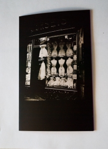
Boulevard de Strasbourg, Corsets Paris by Eugene Atget

Boulevard de Strasbourg, Corsets Paris by Eugene Atget

I think my favourite image in the entire exhibit would have to be Eugene Atget’s Corsets. There is something intriguing about the horizontal and vertical alignment of the mannequins displaying the corsets. It’s an image full of historical data and even probably rather risque for that time period. Did ladies publicly display their undergarments in the late 1800’s or early 1900’s? Or was this a shop for the ladies of the night? I think this image also reveals a little of the photographer’s romantic nature. The fact that the photograph is taken slightly to the side seems to suggest that the photographer did not want to intrude on the female domain by appearing to be too voyeuristic, although he was the original flâneur in the photographic world. Looking at those mannequins in the shop window it seems crazy that women willingly subjected their bodies to such restraining and harmful contraptions all in the name of fashion. But then I look at the young girls of today and can make the same statement about the six inch platform heels that they wear. Fashion is a vicious cycle. Its only the product that changes, but the end goal is always the same – to appear sexy.

Berenice Abbott’s photos are extremely interesting to read. Each image is crammed full of details, almost majestic in adornments. The huge Roman soldier and Indian chief in Sumner Healey’s  Antique Shop, the huge ‘in your face’ signage above the shop front in Rothman’s Pawnshop, the interesting statue outside the Snuff Shop to the window obscured by product prices of Jacob Heymann Butcher Shop, 345 Sixth Avenue are all a sliver of New York history. They represent a time that is past. A time when pride was taken in displays, when individuality was the norm and not the exception as it is today.

Geoffrey James and Lee Friedlander’s window photographs are similar in style. Lots of layers with the photographer’s reflection and that of the city scene behind him reflected in the photograph.

Walker Evans’ Fish Market near Birmingham, Alabama is a delightful image to study. The sign at the top of the building reads “The old reliable house mover”, but just below that under the eaves is a sign stating “Fish & honest weights, square dealings” with two signs on either side of the door listing the prices of the various fish. But in the window and in front of the shop are pumpkins, potatoes and watermelons on display. If one looks through the door and windows of the shop, one sees a few men sitting casually on porch of the building behind. The incongruity of it all makes one wonder what really happens at this place. I found his images to be amazingly sharp with excellent tonal variation.

Some of Phil Bergerson’s images were quite humorous – Springfield, Missouri [we buy men used] to name one. The red trimmed shop with its windows adorned with white paper, blocking all view from the outside has a sense of mystery to it. Especially when one takes the sign into account. The sign says it all, “we buy men used 29 and up”. But in the reflection juxtaposed to the sign one can see the photographer, clearly a man. However, the man is not standing in the normal photographer’s pose. He stands astride with his right arm  across his chest and the left hand in his pocket, almost as if he is a customer considering his options before entering the shop.

I liked David Wisdom’s St Martins Kennels Aviaries & Aquaria, Shelton Street, London 1985 with its horizontal and vertical patterns dominating the image and the lovely saturated green of the building with the softer, muted shades of the window shutters. The closed doors and barred windows makes me want to explore the building. If it is so interesting from the outside, what does it look like inside?

Bruce Stewart’s Walk-ins Welcome photograph is a humorous example of the Gestalt Law of Proximity and Similarity. Four mannequin torsos with legs stand outside a store dressed in pants. The first three mannequins all display various signs displaying from inside the waistband enticing shoppers to make a purchase. A couple even have a few more signs pinned to the pants legs. To the extreme right of the mannequins is another torso, standing akimbo, but this torso has arms and a camera and is clearly someone, probably a tourist posing next to the four mannequins. But my eyes keeps going back to the fourth mannequin because something is bothering me. This mannequin has no sign attached to it. It has no sign in its waistband, instead something with a patterned material is tucked into the waistband and it appears to be oval in shape. On closer inspection I notice that this torso is not standing on a pedestal as the other three are. A clever guise!

There was also a good selection of Fred Herzog’s shop windows on exhibit and as I have reviewed his work in a previous posting when working on the Colour project, I will not cover it here. It really is worthwhile going to see the “old masters” in the flesh so to speak and I’m so glad I put it on my must-see list.

The exhibit can be seen online at the Equinox Gallery website.

References

Pictured Windows. Equinox Gallery [online]. Available from: http://equinoxgallery.com/artists/portfolio/pictured-windows [Accessed 7 April, 2015]

Inside Out: Colin Smith

Inside Out is a reflective name for this exhibition by Canadian photographer, Colin Smith. His exhibition at the Winsor Gallery comprised huge prints made in camera obscura format. Camera obscura is the upside down image displayed in a darkened room with only a small hole in a window cover to allow light in. It’s basically the process of turning a room into one gigantic camera, but without the mirror to invert the image back to us again. This law of optics was known in ancient times.

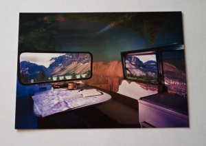
Bow Lake Boler, 2014 by Colin Smith

Bow Lake Boler, 2014 by Colin Smith

What makes Smith’s work so interesting is that he has used an airstream trailer (caravan) and old, abandoned buses in some of his images on exhibit. While the inverted image is reflected on the ceiling and walls of the caravan or bus, the scene through the two windows in the caravan or bus is the right way up. One almost feels that one is looking at a television monitor instead of through a window. I am guessing that he covers the windows while waiting for the camera obscura camera to marinate, so to speak and then removes the covers just before the shutter is pressed. The effect is surreal and quite puzzling. The prints are of a size that the viewer feels as if he/she is right there in the location. At first one can’t figure out just where that place is, things look out of place and there is a dizzying sensation while one tries to make sense of the image, a confusing of the senses.  You feel as if you are upside down, yet right way up all at the same time. The canola fields display boldly on the ceiling of the caravan, while a grain silo stretches out on the table. While through the windows a beautiful landscape of canola fields and the Rocky Mountains stretch out in the distance.

His other camera obscura work, done in some of the well known hotels in Vancouver and on Vancouver Island, were a new take on some very familiar scenery. Although these were “straight” camera obscuras with no window views, they were, nevertheless done on a majestic scale and also engaged the viewer to look through the room in great detail.

All his camera obscura images have a lot of layers and one is really engaged when viewing the images. Initially I had my doubts about attending this exhibition, but I am so glad I went to see it as it has opened the door to some new ideas and techniques.

More of Colin Smith’s work can be seen on his website.

References

Colin Smith [online]. Available from: http://www.colinsmith.ca/ [Accessed 6 April, 2015]

Disfarmer: A Portrait of America

A few documentaries about photography are being screened on local TV’s channel, The Knowledge Network this month as part of the Capture Photography Festival. I have just finished watching the documentary on Mike Disfarmer.

Disfarmer (1884 – 1959) was a photographer from Heber Springs, Arkansas whose best work portrayed rural Americans during wartime and during the Depression years. In the documentary he is described as “scary looking”, “dirty”, “didn’t bother much with talking”, “a loner” and “a weirdo”. He was originally born Mike Meyer, sixth child in a family of seven to German parents. After a tornado in the 1930’s destroyed his mother’s house out of which he used to work, he built his own studio on Main Street, Heber Springs and turned to photography full time. It is told in the documentary that Mike Meyer was convinced that a tornado had picked him up when he was a baby and deposited him at the Meyer’s house and that he did not really belong there. As a result, after the death of his mother, he legally changed his name to Disfarmer, believing that Meyer meant farmer in German and that he wanted no association with that occupation whatsoever, also rejecting his family.

It was mainly the people living in the rural areas who were his subjects. They would dress up in their best clothes, come to town on a Saturday and part of their entertainment consisted of having their photograph taken by Mike Disfarmer. When war broke out, he would photograph young soldiers with their sweethearts or mothers or young ladies who wanted to send a photo to their loved ones behind the lines.

His photographs are very compelling and have a visual grit to them. Most of the subjects have a stark, wide-eyed expression on their faces which looks a little unnatural to me and the children look rather scared. I found this a little off putting. Apparently he would instruct his subjects not to blink and would also ring a bell to startle his subjects. Someone commented in the documentary, that Disfarmer brought out the natural rawness and feelings of his subjects, but I think that is a bit debatable. Yes, the photos have wonderful detail and clarity, but I don’t see the true essence of the subjects being reflected.

One of the interviewees disputes the fact that Disfarmer has gained his fame off Depression photos. He stated that the community was a poor one. They didn’t even know there was a depression on because nothing had changed for them during that time. Everyone was poor.

There seems to be a controversial point raised by some of the photographers who were interviewed about the black line in some of Disfarmer’s portraits. He time and again broke the rule of not having something growing out of someone’s head. His white backdrop had solid black vertical lines and it seems as if he purposely positioned the subjects so that they were centred in front of this line. No one know whether he did this on purpose or just simply didn’t care.

While his photographs are without a doubt excellent, I do prefer those of Dorothea Lange, where a variety of emotions are displayed, even without the person smiling.

Some of his images can be seen on this Vimeo trailer to the movie.

References

Disfarmer: A Portrait of America [documentary film] Dir. Martin Lavut. Public Pictures/Nomad Films Inc. in association with TVO makes you think., Canada, 2010. 52 min 04 secs.

Ruzic, Rob, Disfarmer: A Portrait of America [vidcast trailer, online] 15/01/2011 2 min 28 secs. https://vimeo.com/album/1699435/video/18819679 (accessed 5 April, 2015).