
The brief:
Choose any subject that you can move around and take 8 photos based on the 4 themes of the assignment.
- Shape – this quality has to do with the outline of an object – its edges. These are likely to stand out more clearly if they contrast with the background, and if there is minimum detail visible in the object.
- Form – this is another way of describing the volume of an object – how 3 dimensional it looks. the modelling effect of the light and the way you deal with the shadows is all important. Try to show as much depth as possible in the subject.
- Texture – this is a quality of the surface detail. Fine detail, such as that on sandstone or skin, stands out best with a pattern of small, hard shadows, so you will have to consider both the diffusion (or lack of it) and the angle of the light. Of course, a shiny surface like chrome, although it is thought of as being smooth, also has a texture of a kind.
- Colour – choose a kind of lighting and exposure setting that shows the subject’s colour (or colours) as strongly as possible. In addition, you could photograph your subject in any other interesting, unusual or attractive lighting.
I started this section of the course with much trepidation. I was going to have to use my speedlight which I have not seriously used with any degree of creativity or understanding in over two years. But as I got into the photographic lighting section and worked through some of Light, Science & Magic, I found myself getting more into it and I quite enjoyed some of the challenges that arose. Frustrations, yes there were plenty. I conceived grand ideas that I couldn’t always bring to fruition. My original plan of doing half the images in natural lighting or outdoors (originally inspired by fellow OCA student, Tim Dunk, of giraffe fame) were blown away by a series of Pineapple Expresses (for the past week we have been having about 100 – 200 mm of rain per day). Its rather crazy – every assignment seems to be plagued by rainfall. But then Vancouver does get more than double the rainfall that the UK does!
I have drawn my inspiration from a few sources, namely Rembrandt van Rijn who has to be one of the masters of lighting, Caravaggio, Joe McNally and Francis Giacobetti who I just recently discovered while looking at Stephanie dh’s TAOP website (thanks Stephanie). His use of colour and chiaroscuro are phenomenal and his geometric use of light just mind boggling to a mathematically challenged person like me. I have not done a review on his work yet, but will definitely do so soon when I am not under the gun. I am totally in awe of his work. My planning post for this assignment can be seen here.
SHAPE

Shape 01
f8, 1/100, 34mm, ISO 100
One way to show the shape of an object is to photograph it backlit, thus creating a silhouette. I set up a red backdrop on the outside of my light tent and put my flash inside the tent pointing up about 75 degrees and set my mannequin’s head in profile position. Post processing was limited to adding a bit of contrast and clarity, lifting the shadows slight, and increasing the exposure by 1/3 stop.

Shape 02
f8, 1/125, 32mm, ISO 100
Still keeping the head in a profile position, I then switched the backdrop to white and set my flash on camera left about 45 degrees and moved it back quite a bit as I wanted to get a hard shadow to show the shape of the mannequin’s head. Post processing was limited to a custom white balance, adding a tiny bit of contrast and clarity and bringing down the highlights a tad.
FORM

Form 01
f8, 1/100, 30mm, ISO 100
To show form, or three-dimensionality, I put the flash slightly to camera right and turned the mannequin’s head slightly to the right. This gives a pleasant butterfly lighting under the nose and a slight shadow under the bottom lip, but at the same time a bit of short lighting on the cheek closest to the camera which give form to the cheek apples. There are soft shadows on the left side of the nose and in the zygomatic arch around the eye and some highlights around the throat and shoulder area which help to provide depth to the subject. Only shadows were lifted during post processing.

Form 02
f8, 1/125, 34mm, ISO 100
To show more depth I decided to use Rembrandt lighting for Form 02, so I placed the flash 45 degrees to camera right and raised the flash to about 14 inches above the head of the mannequin. An overhead ceiling light and a torch held slightly behind the subject on camera right provided some needed hairlight to separate the subject from the background. A diffusion panel was held in front of the flash to soften the angle of the shadows slightly. Flash power was 1/8. The contrast between the shadows and hightlights give the three-dimensionality to the subject. The only post processing done was to add 1/3 stop exposure.
TEXTURE
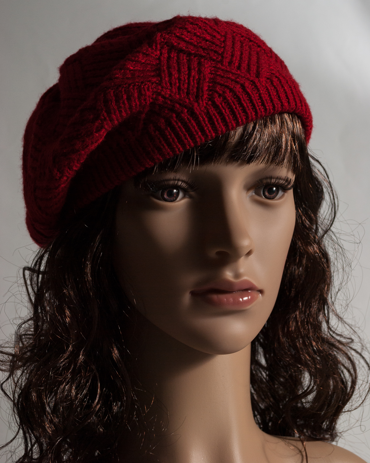
Texture 01
f8, 1/125. 45mm, ISO 100
Texture is best lit from the side, with the light raking over the subject. As this subject is rather smooth I chose to put a knitted beret on her head to add more texture to the scene. I first tried side lighting, but the lighting was not right for the mannequin. After some trial and error in moving my light around, I chose to light from camera right at 45 degrees, and positioned the flash just slightly above her head with a diffusional panel between the light and the subject, so that I could achieve black shadows in the ribbing of the knitted beret and to get a Rembrandt lighting effect on the cheek as well. Post processing was limited to adding contrast, clarity and opening shadows a little.

Texture 02
f8, 1/125, 110mm, ISO 100
For my second Texture photograph, I chose to zoom in on the mannequin’s face with my 50-200mm lens and focus on the eyes, so that the texture of the eyelashes and hair could be seen. The light was to camera right at 45 degrees. Post processing was bringing up the exposure by 2/3s of a stop, adding a bit of contrast and clarity.
COLOUR

Colour 01
f8, 1/125, 35mm, ISO 100
The colour series proved to be the most challenging for me and probably the most enjoyable as well. As mentioned above, my inspiration for this photo was Francis Giacobetti’s work which I am in awe of. His Cuba Music set was my inspiration for this image. As it is Valentine’s day soon I chose to use red as my colour for this image. I used a long strip, folded four times of red cellophane paper and wrapped it around my homemade pipecleaner gridspot and secured the paper in place with an elastic band. The light was to camera left and about level with the mannequin’s eyes and positioned about 2 feet away. I placed a black card on the right hand side of the subject to block any light spillage from behind the subject. I dialed the flash power down to either 1/8 or 1/16 (unfortunately I did not make a note). Joe McNally (2009, p 234) says:
“Want mo’ better color? Less gas. Slow it down. Let the gel marinate the white light passing through it to a nice, spicy rich color. … make sure the gel covers the whole surface of the light, and tightly. If you have white light bleeding through – in other words, ungelled light from the flash flying out and about – it will mix with the gelled light and soften the intensity of the color. So be careful. Seal the gels on there with tape. Don’t let white light escape!”
The image turned out better than I’d imagined and I particularly like the rapid fall off of light, the loupe lighting around her nose and the dark shadow on the right cheek. Contrast, clarity and vibrance were added in post processing.

Colour 02
f8, 25 seconds, 46mm, ISO 100
For my final colour image I again drew on inspiration from Francis Giacobetti and his Beauty series. The specific image that caught my attention was number 8 in the series. Once again I had a black card to the right of the image to block the light. I took a small LED torch, wrapped an 8 inch black foam card around the front of the torch to form a tight snoot. I then played around with exposure time to find an optimal time to paint the mannequin’s face. I first took my folded green cellophane paper, held it over the snoot’s opening and painted the left side of the face for approximately 11 seconds, switched over to red cellophane paper and painted the right side of the face for the remainder of the time, taking care to paint over the hair as well. I found it rather tricky to get the catchlights in the eyes doing this, but quickly figured out that the eyes need a bit of extra painting. I think I may have overpainted the right cheekbone slightly as it is a tad bright, but on the other hand it does provide some sculpting to the face. Post processing involved adding a tiny bit of contrast and clarity to boost the colours ever so slightly.
ASSESSMENT CRITERIA
Demonstration of technical and visual skills (materials, techniques, observational skills, visual awareness, design and compositional skills)
My equipment used for this assignment were my 18-55 mm and 55-200 mm lenses, tripod, remote shutter release, Nikon Speedlight SB 700, Yongnuo RF-603N II wireless triggers, light stand, coloured cellophane paper, homemade grid spot. Because my subject lends itself to portraiture, I have taken care to keep the eyes on one of the rule of thirds line.
Quality of Outcome (content, application of knowledge, presentation of work in a coherent manner, discernment, conceptualisation of thoughts, communication of ideas)
It has been during this assignment that I’ve been able to relate to other photographers’ for inspiration. I think the penny has finally dropped and I think for future assignments I will find myself looking for photographers who inspire/talk to me very early on so that I can research them properly.
I am quite happy with my set of images. Certainly there is always room for improvement, but I think I am at a far more comfortable place using my flash now than I was two years ago. I guess it’s just a question of allowing oneself to experiment and get things wrong and see what works.
Demonstration of Creativity (imagination, experimentation, invention, development of a personal voice)
Due to the static and rather limited nature of this assignment, I think I have achieved a small degree of creativity on a couple of my images – mainly the colour set. I probably spent the majority of my time working on the colour set. I can see that I favour low key images and that is true. I definitely prefer the dramatic shots for portrait work, but I do realise that it can’t be used in all cases. Yes, I have most certainly experimented in this assignment. I would say most of it was down to experimentation, trial and error and figuring things out. The series is not as imaginative as I had originally intended (weather not playing nicely).
Context (reflection, research, critical thinking)
I was quite pleased that I was able to attend more exhibitions during the time leading up to this assignment than in previous ones. The exhibitions that I attended were:
- Eydís Sigurbjörg Luna Einarsdóttir
- Marta Musa
- Lee Friedlander – Thick of Things
- Shimabuku
- Figurative Contemplation, Spatial Understanding and Roz Marshall
I was again lucky to have a gallery respond favourably to one of my reviews, namely the Shimabuku review. The response can be seen here.
I have gained a much better understanding about light and I now find myself looking for lighting patterns when viewing movies on TV. I looked at numerous flash tutorials on the website, too numerous to mention, some helpful and others not so much. I drafted a quick and dirty reminder for myself on lighting terminology, which includes a great video tutorial by Mike Wallace on the Inverse Square Law – the visual application is so much easier to understand than the mathematical one. I also viewed most of Kevin Kubota’s online workshop on building and using DIY lighting gear. Also worth mentioning is Glyn Dewis’ tutorial on how to create an invisible black background, something which I used quite extensively during this assignment:
My camera club featured a hands-on workshop on abstract photography, presented by Canadian photographers, Russ and Wendy Kwan, which I found incredibly interesting and will definitely experiment a bit with that, hopefully in a later assignment.
I managed to connect with another fellow OCA student here in Canada, which was great. We arranged a time for a Skype meeting just after Christmas and although she is doing Textiles degree, we found a lot of similarities and common ground in our courses. We live in different provinces, about 1,500 km apart, but have resolved to meet at least once a month to touch base with each other. It would be great if a few more North and South American fellow OCA students can join in.
A couple of photographers inspired enough me to write up reviews on their work:
Book Reviews:
Artists Reviews:
It was my intention to have added Sontag to the reading list for this assignment, but alas I’m finding it difficult to concentrate when I read her. By the end of assignment 5 I fully intend to have finished and reviewed Sontag’s On Photography.
I have decided that I am also going to try and purchase some of the exhibition catalogues of the exhibitions in the UK. In that way I can keep up with my fellow students and take part in their conversations about the exhibitions. I guess its the next best thing to attending the big, well-known exhibitions, but the book is definitely cheaper than the plane ticket.
References
Giacobetti, Francis. Francis Giacobetti [online]. Available from: http://www.francisgiacobetti.com/ [Accessed 5 February, 2015]
McNally, Joe (2009). The Hotshoe Diaries: Big Light from Small Flashes. Berkeley: New Riders
Bibliography
Freeman, Michael (2013). Capturing LIght: The Heart of Photography. Lewes, England: The Ilex Press.
Hunter, Fil et al, (2012). Light—Science & Magic An Introduction to Photographic Lighting. 4th ed. Oxford: Focal Press
McNally, Joe (2008). The Moment it Clicks. Berkeley: New Riders
Peterson, Bryan (2011). Understanding Flash Photography. New York: Amphoto Books
van Niekerk, Neil (2013). Direction & Quality of LIght. Buffalo, New York: Amherst Media, Inc.
van Niekerk, Neil (2009). On-Camera Flash: Techniques for Digital Wedding and Portrait Photography. Buffalo, New York: Amherst Media, Inc.


